Jump to content
  • entries
    943
  • comments
    5,899
  • views
    924,395

Carve, hollow, and cleaning up the scene tree


Josh

6,664 views

 Share

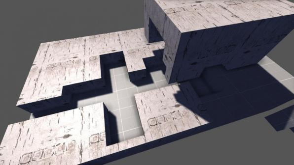
CSG carving now works very nicely. The hardest part was making it work with the undo system, which was a fairly complicated problem. It gets particularly difficult when brushes are in the scene hierarchy as a parent of something or a child of something else. Carving involves the deletion of the original object and creation of new ones, so it is very hard to describe in a step-wise process for the undo system, especially when all manner of objects can be intermixed with the brush hierarchy.


blogentry-1-0-77067500-1425864154_thumb.jpg


Eliminating the ability for brushes to be parented to another object, or another object to be parented to them, would solve this problem but create a new one. Compound brushes such as arches and tubes are created as children of a pivot so that when you select one part, the entire assembly gets selected. Rather than a hierarchy, the old "groups" method from 3D World Studio would be much better here. It becomes a problem when you carve a cylinder out of a brush and are left with a lot of fragments that must be individually selected.


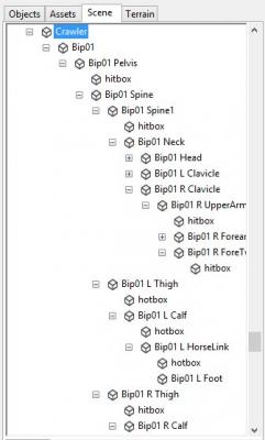
At the same time, the scene tree needs some love. There's too many objects in it. The primary offenders are brushes, which maps just tend to have a lot of, and limbs in character models.


blogentry-1-0-94988700-1425873128_thumb.jpg


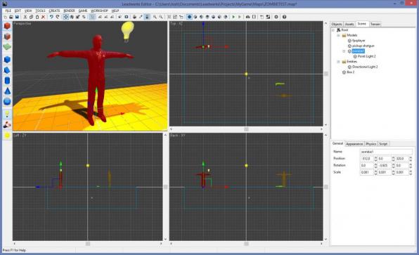
Filters like in Visual Studio could help to eliminate some of the noise here. I would set it up to automatically add new brushes into a "Brushes" folder in the scene tree. What would be really nice is to eliminate model subhierarchies from the scene tree. This means the limbs of a model would be effectively invisible to the editor, but would still allow parenting of different objects to one another. In the screenshot below, the crawler skeletal hierarchy is not shown in the editor, but he has a particle emitter parented to him Opening the model in the model editor will still show the entire sub-hierarchy of bones.


Notice the character has a point light as a child, but its own limb hierarchy is tucked away out of sight.


blogentry-1-0-98876900-1426436232_thumb.jpg


If the model sub-hierarchy were not shown in the scene tree, this would free me from having to treat hierarchies as groups, and implement a grouping feature like 3D World Studio had. Filters could be added as well, instead of relying on a pivot to organize the scene hierarchy.


blogentry-1-0-34886900-1426436401.jpg


blogentry-1-0-20292000-1425911827.jpg


To sum up, this change would cause group selection to be based on user-defined groups rather than limb hierarchy. The sub-hierarchy of model limbs would no longer be visible in the editor. Objects could still be parented to one another, and they would be parented to the base model rather than a specific limb.


What changes:

  • Ability to adjust individual limbs in model hierarchy. For example, if you wanted to add a script to a tank's turret, the turret should be a separate model file you parent to the tank body in the editor. It would not be possible to set the color of one individual limb in a model file, unless you had a script that found the child and did this. Setting a color of the model would affect the entire model, including all limbs.
  • Ability to parent a weapon to one specific bone in the editor. Scripts cam still call FindChild() to do this in code. Which is what I suspect most people do anyways, because diving into the mesh limbs to find one specific bone is pretty difficult.


What we gain:

  • One button to group / ungroup objects.
  • No more confusing multi-selection of entire limb hierarchies.
  • Compound brushes no longer need a pivot to hold them together, can be created as a new group.
  • Carved brush fragments can be automatically grouped for easy selection.
  • If model hierarchy changes, reloaded maps match the model file more accurately; no orientation of limbs in unexpected places.
  • Faster, less bloated scene tree without thousands of unwanted objects.
  • Better entity selection method to replace drag and drop.
  • The scene tree in general feels a lot less weighted down and a lot more manageable.


It is possible this may modify the way some maps appear in the editor, but it would be an "edge case". Improvements are needed to accommodate brush carving and address the present limitations of the scene tree. This does not involve any changes to the engine itself, except updating the map load routine to read the additional data.

  • Upvote 15
 Share

21 Comments


Recommended Comments

Opening the model in the model editor will still show the entire sub-hierarchy of bones.


What about making hit boxes on those limbs? Doing this visually is ideal. Would be cool to add this to the model editor and have it saved with the mdl file really.

Link to comment

Because animated models don't get their skin weighted on the CPU, only the GPU. So the picking would only occur on their default T-pose, not on their actual animated geometry.

  • Upvote 1
Link to comment

Why not giving the possibility to merge pieces of BSP ?

It's a big prerformance improvment as you have one object only instead of multipl ones, and merging vertices is also a big benefit because it's less vertices to process.

  • Upvote 1
Link to comment

I like Grooves suggestion. If we can still alter individual faces of merged BSP mesh then I would like to to do it my self. For instance carving a tube hole in a box leaves you with dozens of pieces which you need to go and manually group. Adding an option to automagically merge them on carve (for instance Ctrl + Shift + C) would be awesome. Anyway I'm grateful we at least have some CSG tools to work with. Looking forward to Slice, Vertex Ed and Extrude if that's on your list.

Link to comment

The features are nicely executed I like it.


I can't seem to add an entity back onto the root node now. Is that by design to have the first level all filters?


Also a little suggestion with the filters. It would be nice if you click on an entity in the world the filter expands that contains it.


Thanks!

Link to comment

Awesome addition. Just tried it with blocks using a smaller block to carve out of a big block. Not sure what the size prompt thing is in Hollow, is it like making swiss cheese?

Link to comment

Looks like the hollow thickness prompt will let you set the wall thickness. So make a box or a cylinder and then hollow it with preferred wall thickness. Then you could carve out windows and doors from in those walls. Circular rooms etc. made easier, very nice.


The new changes on the scene panel look very useful. I'm going to export my current project first and then take it for a proper spin.

  • Upvote 1
Link to comment

Will grouped objects be gathered together in the scene tree maybe under a group filter? Right now they add to clutter in the scene tree vs using the hierarchy.

Link to comment

Testing carving and hollow, working great so far. smile.png


Edit: smoothing of carved/hollowed items seems a bit off.

Link to comment

Really well done, makes the editor a whole lot more use- and powerful. Though for usability's sake I would love to see Carve and Hollow added to the right click menu as well, even though there are shortcuts, it feels like it belongs there.

Link to comment

I'm wondering why we even need the scene tree at this point. I personally never use it.


That's an interesting point. The editor kind of guides you into using it because it's the same tab that also shows an objects properties and is/was only way to group stuff and also make prefabs. Do we really need it? Is it just a distraction that slows down productivity, tempting us to scrutinize and manage the scene tree all the time. I'm trying to imagine working without it but I think I'd need to be able to switch it off so I'm not tempted to look at it and see if I actually miss it for anything. :)


Usually for picking stuff in the editor it's quick to just buzz over to it in perspective view anyway to make sure you select the right thing. But you would need to be able to save prefabs somehow without it.

Link to comment

I'm wondering why we even need the scene tree at this point. I personally never use it.


If there was a "dont like this button", id press it... twice!!

  • Upvote 3
Link to comment
Usually for picking stuff in the editor it's quick to just buzz over to it in perspective view anyway to make sure you select the right thing. But you would need to be able to save prefabs somehow without it.

lol

What do you mean ? no more scene Tree ?

You would struggel to find precise objects or select objects that are distant miles away in your map.

Link to comment

Not really, at the moment I find it quicker to move and find things in perspective with Shift + Mousewheel. You can cross a full terrain in no time like that. But it takes me much longer to find anything in the scene tree, it just ends up a long wall of text that makes it hard to find anything when you have lots of stuff in the map. With the filters it will be a bit better to organise and find things but you would really need grouped objects in a filter too or something or it will be a bit messy in a different way.

Link to comment

If there was a "dont like this button", id press it... twice!!

If you press it twice, it undoes your vote. So I assume that means you are neutral. ;)

Link to comment

If you have prefabs with child objects I seem to recall selecting the object in the 3d perspective always selects the entire prefab. Scene graph is how you can select only child object of the prefab as far as I've seen.

Link to comment
Guest
Add a comment...

×   Pasted as rich text.   Paste as plain text instead

  Only 75 emoji are allowed.

×   Your link has been automatically embedded.   Display as a link instead

×   Your previous content has been restored.   Clear editor

×   You cannot paste images directly. Upload or insert images from URL.

×
×
  • Create New...