Jump to content
  • entries
    943
  • comments
    5,899
  • views
    924,383

Website Concepts


Josh

2,840 views

 Share

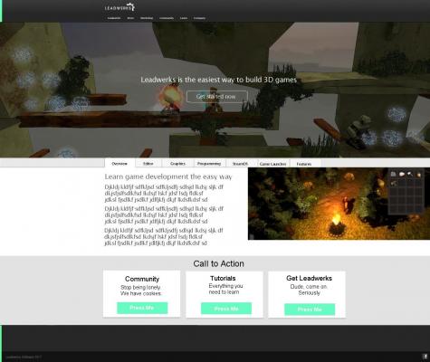
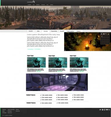
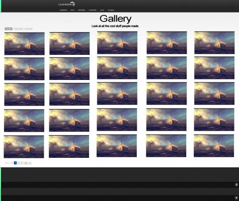
Here are some concepts I came up with for the site redesign.


blogentry-1-0-28096400-1488243640_thumb.jpg


blogentry-1-0-75543500-1488236499_thumb.jpg


blogentry-1-0-17914300-1488236510_thumb.jpg


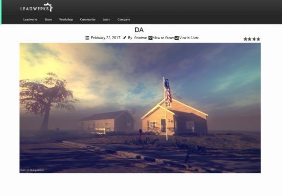
The bold no-bull**** interface of itch.io inspired this design:


blogentry-1-0-48946400-1488241588_thumb.jpg


I think what will work best is if the designer takes my rough sketches, turns it into a clean design, and implements it with clean code.


I don't think we can change the whole site over at once without me losing control of the creative process and having runaway costs. I want to focus on the pages I have shown here and establish a foundation I can experiment with and iterate on.

  • Upvote 4
 Share

9 Comments


Recommended Comments

What's going on with the Games link? Where will it be?
I think I'm going to do a highly selective list of only the top, top games. It's a little more complicated, and I will probably defer that and the Workshop for a while.
Link to comment
Does that mean that most or all of the tournament entries won't be hosted on the site any more?
I don't know. On one hand, I love the degree of community-driven content we have on this site. On the other hand, the top ten games get drowned out. I'm not sure what will happen.
Link to comment

In the tradition of wanting it all, I don't think a compromise would be a bad thing. Have the games link take you to the top selected/featured games by default, then by rating/downloads.

Link to comment

I'd love some widescreen support for the website. And +1 for the community-driven content. Shows what's possible with the engine from a user perspective. I'd be okay with (hand-picked) top content only.


Also, have you considered making the banner a short video on what Leadwerks is / stuff people made with it? I think it'd fit

I agree, hand-picked top games (tagged?) + the beautiful chaos of everything else is appealing to me.


Yes, the landing page banner is meant to be a video with a few seconds from a variety of games. We've got plenty of footage to make it interesting.

Link to comment
Guest
Add a comment...

×   Pasted as rich text.   Paste as plain text instead

  Only 75 emoji are allowed.

×   Your link has been automatically embedded.   Display as a link instead

×   Your previous content has been restored.   Clear editor

×   You cannot paste images directly. Upload or insert images from URL.

×
×
  • Create New...