Jump to content
  • entries
    943
  • comments
    5,899
  • views
    924,380

Website Updated


Josh

3,449 views

 Share

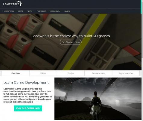
Our website has been updated with a new look and responsive design. Here are a few highlights.


Landing page:

blogentry-1-0-33605400-1489032564_thumb.jpg


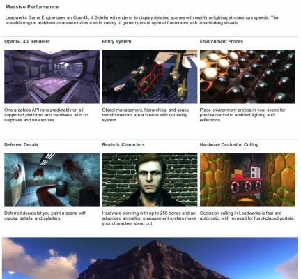
Product pages:

blogentry-1-0-30517000-1489032631_thumb.jpg


Screenshots used in the site from games will display the title and author when you hover the mouse over them.


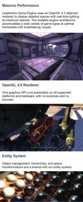
Responsive layout scaled for phones:

blogentry-1-0-17785100-1489032656_thumb.jpg


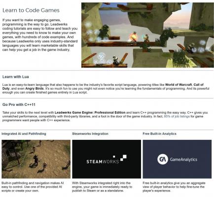
Clearer writing that says exactly what Leadwerks does and who it is for:

blogentry-1-0-95312500-1489032672_thumb.jpg


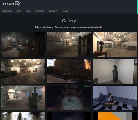
Dark gallery and video pages:

blogentry-1-0-59513400-1489032715_thumb.jpg


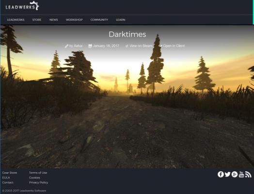
Sleek screenshot pages:

blogentry-1-0-34674700-1489032735_thumb.jpg


I left the Workshop pages as-is for now. The forum software is going to be updated and a new skin will be designed for the new version of the community software.

  • Upvote 9
 Share

10 Comments


Recommended Comments

Wow, looks really great. It feels very fresh, and makes the engine itself more updated somehow. Probably cause the old site just made a list while this gives you screenshots/pictures of what the engine is capable of!

Link to comment

Really nice, responsive design works reading from Android phone.

Tutorials and community pages feels a bit off, can see is the old site looks bit different.

Link to comment

Looks real nice. Information about the engine's features are a lot clearer, gives a much better idea of what it can do.

Link to comment

looking good :)

There is no more a games section?

I think ppl may want to see and play what Leadwerks users are making.

Link to comment

looking good smile.png

There is no more a games section?

I think ppl may want to see and play what Leadwerks users are making.

I am still thinking about this. I think there's going to be a showcase of about seven top games, and maybe a general listing. I do not know if these will be merged or how it will work. We have the general games database, we have the game launcher games fetched with the Steam web API, and we have a hand-curated selection of games I want to show off. So I need to think about this some more.

  • Upvote 1
Link to comment

This took a good chunk of time but I feel like it sort of improves everyone's "self-esteem". The images the community has created over the years really make it shine. :D

Link to comment

Personally think you should have the bottom footer as one line, as it is in the forum.

Also I think the navigation for the gallery should be centered , and the sort options both on the top right and the bottom right of the list.

Link to comment
Guest
Add a comment...

×   Pasted as rich text.   Paste as plain text instead

  Only 75 emoji are allowed.

×   Your link has been automatically embedded.   Display as a link instead

×   Your previous content has been restored.   Clear editor

×   You cannot paste images directly. Upload or insert images from URL.

×
×
  • Create New...