Menus and Weaponeering
On the whole, I'm starting to warm to using text for user options, the nineties style. Dave showed me some icon screenshots from ArmA and remembered why I didn't like them. Is that a steering wheel? Desk fan?
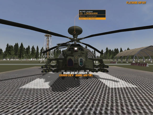
Below is an in-game shot showing the menu and data displays for helicopters. Not unlike something you might have seen in older games using pre-rendered art. All interactive objects around the base will have these. If you don't want the floaty status text, CTRL L (for labels) is your friend.
Eventually each helo flight will pull it's call-signs from a datafile (Twodogs, Ugly, Badman, Goody etc.) which will go in placed to the current auto-generated ID. Status refers to the ground crews work time to prepare the helo for it's next sortie. Fuelling and weaponeering.
The play process is typically pick-mission, go to aircraft, pick weapons if default not to liking, hit the fly button. It's been the same in games from Wing Commander to Black Shark. Pretty much universal. And we don't want to break that. Reading how UK operations conduct Apache helicopter turnaround, the Apache lands, is guided into an arming bay and re-armed immediately so it's ready for the next flight whenever that may be. No hanging around waiting for a bird to be armed if you're urgently needed in a support action.
To facilitate this into the traditional game flow, brief>arm>fly, the ground crew servicing timer starts after landing and shutdown. But as the player may change weapons seconds before flight and we don't want to delay, we'll let the players arming choice count as the arming done after landing. With a realism option in to have "Real-time arming" for sim pilots who love to thrash themselves with birch-twigs - metaphorically speaking.


0 Comments
Recommended Comments
There are no comments to display.