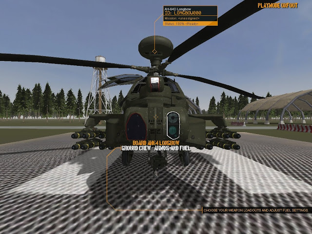
Menus and Weaponeering pt2
I was thinking over some official forum posts and one gentleman indicated that they were partly colour-blind. Accessibility issues are something I think about whenever I'm writing software or web site design work so I kicked myself when I didn't apply that to the interface. I added some GUI elements that link current selection to the tooltip, this should avoid ambiguity in the menu system.
So that's all working as it should, just have to fix up the weapon selection system which will be based loosely around this mock-up...
We has some debate about walking around in ground mode clicking on weapons displayed on the ground like in the above picture. Or some other mechanism involving a fixed camera that cycles through each pylon and a vertical list to choose from.
On the whole, there's not much difference in workload, both are fairly trivial to implement. It's become a style choice. But I'm torn between traditional as above, or flashy console panning cam and up/down list.
Either way it's a far cry from Gunship 2000...or is it?
Which method will I implement? Stay tuned for the next thrilling blog post when all will be revealed.


0 Comments
Recommended Comments
There are no comments to display.