Environment, weather, day cycles, iPhones, everything.
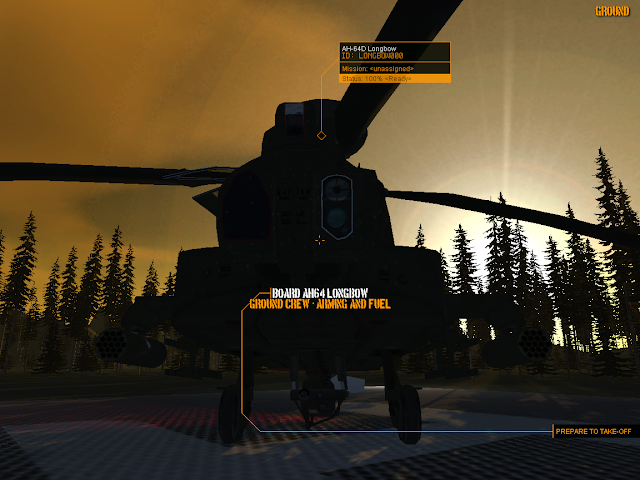
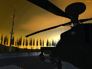 It's not going to win any awards for realism but we have a rudimentary ENV environment class that handles time-of-day ticking and updating scene elements accordingly. Lighting, colouring, fog, sun position. Currently it's using computed light values which renders lovely post apocalyptic scenes, the colours are terrible IMO, looks like a nuke's gone off. A lookup table will be better and an exercise I'll leave for later. Also I added some data structures for moving weather zones around the map. These are trigger zones for adjusting fog density as you penetrate. To be used for any spot environmental effects we want to add, dust-storms, rain.
Not clear how best to add the gradient data, the old Combat Helo code used a tiny 64x64 bmp. Can't seem to find the graphic I used.
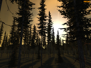 In the remote chance I get to implement "Megaparticles" (looks around for Shader X book) the skies would benefit from 3D looking clouds. Value vs. performance. Helicopters on our battlefield won't be spending much time at altitude and we're not a fighter sim. We can manage some rudimentary clouds but I'd avoid using particles. Fill rate costs are not worth it. Which leaves billboarding and textured planes which are cheap to render.
iPhone development picked up a pace. With access to my big box of assets, Dormouse (lead dev on that project) was showing me how to fly a Sophwith Camel around with nice springy 3D person camera moves and the base skybox I just made for CombatHelo. Nice little exercise to explore what we can do with Unity iPhone. Some rudimentary shaders, OpenGL and javascript. From what I've been seeing, it's not that far removed from LUA scripting in Leadwerks although I find the way Leadwerks interacts with entities more intuitive.
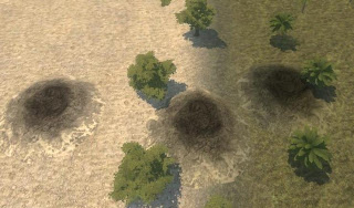 Dave, part man-part frame-buffer, tackled craters and we had the problem of blending them with the terrain, especially when we have massive z-buffer artifacts with co-planer polys near the outer-regions of the map. Leadwerks nice built-in library of shaders proivded the answer. Using a terrain hugging vertex shader, the crater morphs to fit, and the frag shader does a reasonable job of blending in the base texture to the terrain.
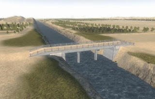 And we have a new concrete bridge for Herat. The region map has been a work in progress for close to three months now. All the compounds, village buildings, structures number approx 502 with the airbase and the city of Herat yet to complete.
It's a massive region on foot, and takes a while to fly across. Navigation is a bit of a problem, I hope to fix that with a pop-up map if I can work out how to blend the different map layers from the terrain buffers to make something readable. Otherwise it's going to have to be another pre-loaded DDS texture with enough resolution to zoom in.
Here's more of my least favourite colour in games. Brown.



5 Comments
Recommended Comments