Improving HUD readability
HUDs often used in simulators adopt a green hue and use an additive or alpha blend. It can be hard to read them in some conditions and this is something I was thinking about so I tried a few experiments, non of which I like fully.
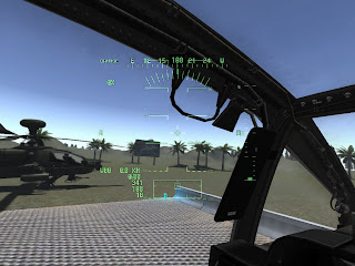
First: To improving readability of heads up displays by down-sampling the HUD buffer to a smaller buffer (I called the hud_fx_buffer) with a texture filter, a poor-mans blur. Using the resulting 'fuzzy' version to reduce the intensity level of the background image.
Has potential, reduce the resolution of the hud_fx_buffer too much and you get a darkend 'strobe' effect around the symbology which is akin to what you see on video tapes. It think with a Gaussian blur effect and a higher res buffer it might be a winner.
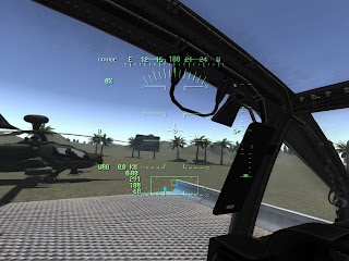
Second experiment, the ubiquitous drop-shadow.
Yuck. Looks like a drop-shadow. It's the same down-sampled hud buffer with a small offset. It works though, can clearly see the symbology against the lighter parts of the horizon without resorting to 'orange' or black.
The hud 'clarity' will remain a user option, off by default.
*update*
One last toy, a twinkly hud glow. This is actually quite pretty in motion and again reminded me of some old HUD tape footage shot in old Jaguar aircraft.
Good for simulating what it's like to have certain eye-conditions. Another one for the cutting-room floor.
Finally, below we have hud glow mk2, a more subtle variation which is just a glow applied, mipmaps help soften out the hud image.


0 Comments
Recommended Comments
There are no comments to display.